
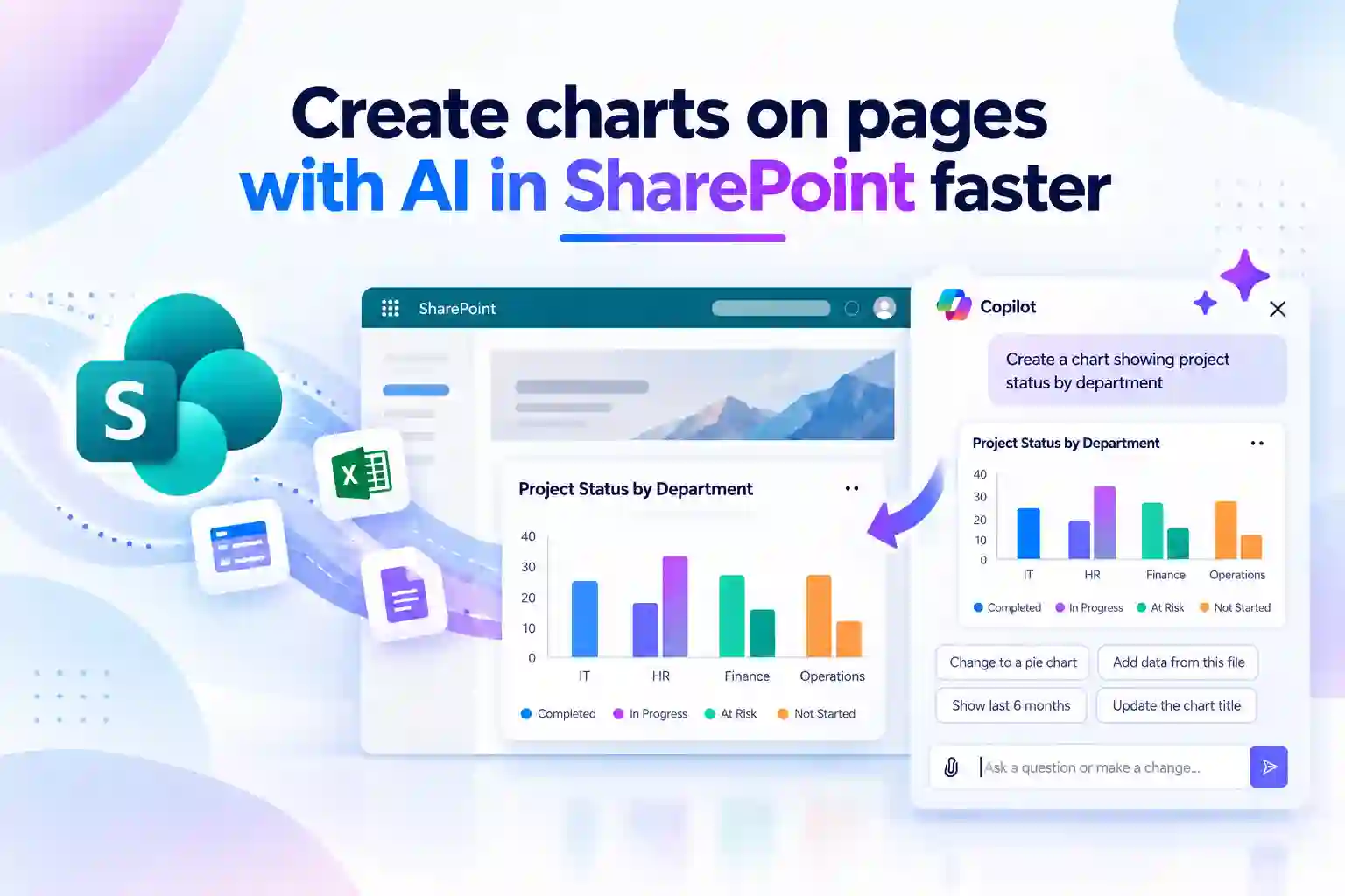
Important data should not get lost in long tables, scattered spreadsheets, or text-heavy SharePoint updates. When people can see the story behind the numbers, they can understand priorities faster and make more informed decisions.
The AI-assisted Chart web part in SharePoint helps turn everyday business data into interactive visuals directly on a page. By using natural-language prompts, you can create charts, refine the information, and present updates in a format that is easier for your audience to scan and understand.
Whether you are sharing project progress, employee training results, IT service trends, or business performance, AI-powered charts can make SharePoint pages more useful, engaging, and action-oriented.
What Is the AI Chart Web Part in SharePoint?
The AI Chart web part is a SharePoint capability that helps page authors create charts through simple, natural-language prompts. Instead of manually configuring every element, you can describe the data you want to visualize and let AI assist with chart creation.
For example, you can request a chart that compares quarterly revenue, shows project status by department, or highlights employee onboarding completion. You can also attach relevant files to provide additional context when creating the visual.
This makes chart creation more accessible for people who need to communicate data clearly but may not want to spend time building charts from scratch.
Key capabilities at a glance
- Create interactive charts directly within modern SharePoint pages
- Use plain-language prompts to describe the chart you need
- Attach relevant files to provide context for the chart
- Add, edit, or remove chart data through follow-up prompts
- Adjust the appearance and format of a chart conversationally
- Revert changes using the Undo option in SharePoint
- Work within existing SharePoint permissions and Microsoft 365 policies
Start Creating Charts from the SharePoint AI Experience
When you are editing a SharePoint page, you can begin creating a chart through the AI agent chat pane. This makes it easier to start with the outcome you want rather than spending time figuring out chart settings first.
Open the SharePoint page in Edit mode. Then select the Agents icon in the upper-right navigation or the AI sparkle icon in the page toolbar to open the AI chat pane.
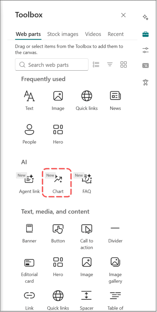
Access the AI chart experience from SharePoint web part toolbox
💡 Ask “What Data Should We Visualize?”
A good chart begins with a useful question. Before publishing a new visual, identify the information that your readers struggle to understand in its current format.
You can invite teams to identify useful chart opportunities through a short internal post or message.
Consider asking:
- Which business update is difficult to understand from a table alone?
- What recurring report could be easier to scan as a visual?
- Which team metric would help people act faster if it appeared on a SharePoint page?
This approach can uncover practical ideas for SharePoint dashboards, department pages, and regular internal updates.
Prompt an AI Chart Using the SharePoint Web Part Toolbox
You can also add a chart from the SharePoint web part toolbox while designing or updating a page. This is helpful when you already know where the chart should appear in the page layout.
While editing the SharePoint page, open the web part toolbox and search for Chart under the AI category. When you add the Chart web part, the AI chat pane opens automatically.
You can then use a prompt to explain what you want the chart to display. Focus on the information that matters most to the reader and the decision or action the visual should support.
Include these details in your prompt
- The data you want to visualize
- The categories or values you want to compare
- The chart type you prefer
- The time period covered by the data
- The main insight the audience should understand
- Any file that provides useful context
For example, if you are creating a project page, you could ask for a chart that shows workstream progress, open risks, and delayed milestones. This can make a status update easier to understand than a long written summary.
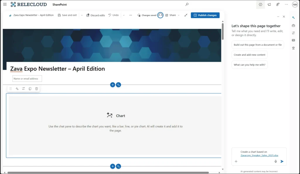
Prompt to add a chart through the chat pane:
The first version of a chart does not always tell the full story. After creating a chart, you can use follow-up prompts to refine the data, update the appearance, or make the visual more relevant for the people viewing the page.
This is especially useful when you need to simplify a chart for leadership, include additional data for a project team, or adjust the visual after receiving feedback.
Example follow-up prompts for SharePoint charts
- Add a separate category for completed projects
- Remove the data for the previous quarter
- Change the chart to make department comparisons easier to read
- Update the chart title to Project Delivery Status
- Make the visual suitable for an executive update page
- Show the highest-performing department first
- Add the latest data from the attached file
Use the Undo option in the command bar if you need to revert a change. This helps you explore different ways to present information without losing control of the page content.
📊 Share a “Prompt of the Week”
Many people want to use AI more effectively but are unsure where to start. A simple weekly chart prompt can help make the SharePoint AI experience feel more practical and approachable.
Share one prompt through your intranet, Teams channel, or internal newsletter. Encourage people to adapt it to their own work.
Sample prompts to share
- Create a chart comparing open and closed service requests by month
- Visualize onboarding completion by department
- Show the top five knowledge-base categories viewed this quarter
- Compare planned and completed tasks across project workstreams
- Display employee training completion rates by business unit
This creates a steady flow of useful ideas while encouraging people to use SharePoint pages for clearer data communication.
Why AI Charts Matter for SharePoint Page Authors
SharePoint pages often bring together essential updates, documents, announcements, resources, and reports. However, when a page contains too much text or too many data tables, readers may find it difficult to identify the most important message.
Charts can simplify complex information and help readers spot patterns, progress, gaps, and priorities more quickly. With AI assistance, you can create these visuals without interrupting your page-authoring process.
An effective chart can turn a lengthy update into a clear message. Instead of asking readers to compare rows of data manually, you can help them immediately see what is improving, what needs attention, and where action may be required.
Practical SharePoint AI chart use cases
- Project management: Show milestones, completion levels, delivery risks, and workstream status
- HR and employee communications: Visualize survey results, training completion, and onboarding progress
- IT service reporting: Present ticket trends, service performance, and issue categories
- Sales and business updates: Compare targets, pipeline stages, and regional performance
- Operations dashboards: Highlight workloads, requests, inventory, and process performance
- Leadership reporting: Present important metrics in a concise, visual format
The goal is not simply to add more charts to SharePoint. It is to help people understand information faster and act on it with greater confidence.
Keep Data, Permissions, and Governance in Focus
AI can make chart creation faster, but the quality of the final visual still depends on the data and the person publishing it. Before adding a chart to a SharePoint page, review the data for accuracy, relevance, and clarity.
Make sure the chart has a clear title, uses understandable labels, and focuses on the message readers need to take away. Avoid adding too many categories or visual elements that may make the chart difficult to read.
The AI Chart web part works within existing SharePoint permissions and Microsoft 365 policies. This helps ensure that data access and organizational controls continue to apply while authors create and refine charts.
Recommended preparation steps
- Inform SharePoint page authors about AI-assisted chart creation
- Review Microsoft 365 Copilot license assignments for intended users
- Update internal SharePoint authoring guidance and training material
- Encourage authors to validate chart data before publishing
- Use clear chart titles, labels, and descriptions
- Avoid including sensitive information unless users are authorized to access it
- Follow existing governance, review, and page-publishing practices
A well-governed approach helps teams use AI-powered SharePoint charts with confidence while keeping business information clear, relevant, and protected.
🚀 Run a “Before vs. After” Chart Challenge
A simple before-and-after activity can show how visuals improve internal communication. Ask teams to choose one text-heavy update, manual report, or spreadsheet summary and transform it into a clear SharePoint chart.
Participants can share:
- The original table, report, or written status update
- The chart created for the SharePoint page
- One key insight that became easier to understand
- One action the audience can take after viewing the chart
This helps teams see how AI-assisted chart creation can make everyday communication more useful and less time-consuming.
AI Charts vs. the Quick Chart Web Part
SharePoint provides different options for creating charts, depending on how you prefer to work. The AI Chart web part supports prompt-based creation and refinement, while the Quick Chart web part is designed for manually creating simple charts with entered data or SharePoint list and library data.
Capability | AI Chart Web Part in SharePoint | Quick Chart Web Part |
|---|---|---|
Creation method | Natural-language prompts through the AI chat pane | Manual configuration |
AI assistance | Yes | No |
File context | Relevant files can be attached to provide additional context | Uses manually entered data or SharePoint list and library data |
Editing approach | Follow-up prompts for chart data and visual updates | Edit data and chart settings manually |
Best suited for | Fast, AI-assisted chart creation and iterative visual storytelling | Simple charts created from structured data |
Both options can be useful in different scenarios. If you want to quickly create a visual using a prompt and refine it as you work, the AI Chart web part offers a more guided experience. If you already have structured data and prefer direct configuration, the Quick Chart web part remains a practical option.
Make SharePoint Data More Actionable with AI
The AI-assisted Chart web part gives you a faster way to transform data into useful SharePoint content. By creating charts through plain-language prompts, attaching relevant context, and refining visuals with follow-up instructions, you can spend less time formatting and more time communicating what matters.
This capability can make SharePoint pages more informative for employees, more engaging for stakeholders, and more valuable for decision-making. It supports a more visual approach to sharing business information while keeping chart creation within the familiar SharePoint page-authoring experience.
When used with accurate data, clear messaging, and thoughtful governance, AI-powered charts can help turn everyday SharePoint pages into stronger communication tools.
Learn More from Microsoft
Explore these Microsoft resources to learn how AI-powered charts and SharePoint web parts can help you build more visual, data-driven pages.

















 Migrate
 Manage
 Migrate Microsoft 365